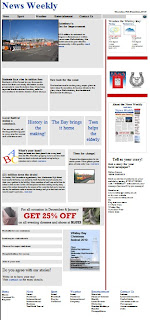
When creating the website pages we used a similar layout to the News Guardians site, as we liked the layout of it when researching, also as it is a local paper we could relate and include similar headlines and links. Although we set out our headlines different to this as we chose a different approach with our stories and headlines. Also we decided to include a column down the right of our page that stays the same on all of our pages, which includes the weather for the day, adverts and also 'tell us your story' where the reader can contact the newspaper. We didnt come up with the second page of the newspaper plans as it will be similar to the main page but with our main article, Sainsbury's, including the full article and the including links to other pages. Therefore we thought the plans for this would be irrelevant and time wasting when making the website as it was very time consuming.
Draft
This final design differs from our draft as when we began ceating it, we found difficulties with the programme we used, Microsoft Expression Web 2. It was difficult for me personally as it was hard to rearrange the layout and design of our newspaper. Also when inserting images the rescaling or manouvering of them was difficult to do and was time consuming. Although the final product looks good, it took a lot of effort making it, and i feel it could of been made better if we used another programme. Bellow is the screen shot from when we created the website, and how we had to insert the images and texts speciffically into different boxes that had to be altered after most edits.
Final Design
Page 2
We used the same colourscheme (blues and reds) to link with our newspaper, therefore it would all link together and would show familliarity to the reader as it would be very similar. Although we changed the style from columns to just leaving it in a website 'blogger' form, allowing differentiation between the two. We kept the layout all very simple and the design of it all was sectioned with boxes to show the reader the different headlines and briefs. Also we used the same masthead but made it a smaller size font as it wasnt our main focus on the website, and from our research other newspapers have done the same.


