The News Guardian

This paper for Whitley Bay which offers free news opts for a very plain layout; this suggests a certain audience as it only shows the typical topics a paper would write about this is a result of the paper being posted through peoples doors. Therefore not knowing who buys the paper and what they would like to read, so they give a variation of everyone’s tastes. As a result they use a colour scheme that relates to the printed newspaper, with all the colour being in the text and the rest being predominantly white. Therefore this appeals to all audiences with having no boldness that might hint to a certain audience. The mast head is taken from the newspaper so it shows familiarity and links to it. The paper takes a basic website layout and has the main link column down the left giving space for the story of the day and other links to headline stories. Another predominant feature of the website is the advertisements for local businesses, this is where the paper receives advertising revenue therefore being able to give the paper away free, although it can be bought as well from local shops.
The Times.

I decided to look at The Times as this paper isn't based for a local area and therefore has to appeal to a mass audience. As a result i would like to take key characteristics of this newspaper so I can try to create a wider audience range. Similar to the News Guardian it opts for a predominantly white colour scheme, although this links with the paper style with the black text and dark blue and dark red features. The masthead being the one from the paper is centered at the top of the page therefore drawing the audience’s attention. It is clear that it has a different audience range as there is a lot more text for the stories and differs from the others as they just have the links to the articles. The links are across the top and show the range of topics for the paper and therefore shows the audience range as well, for instance the business section and the art, typically for more so, well educated people. A comparison between The Times and the News Guardian is the advertisements and The Times doesn't show any and therefore relies solely on the sale of the newspaper to provide income.
The Guardian
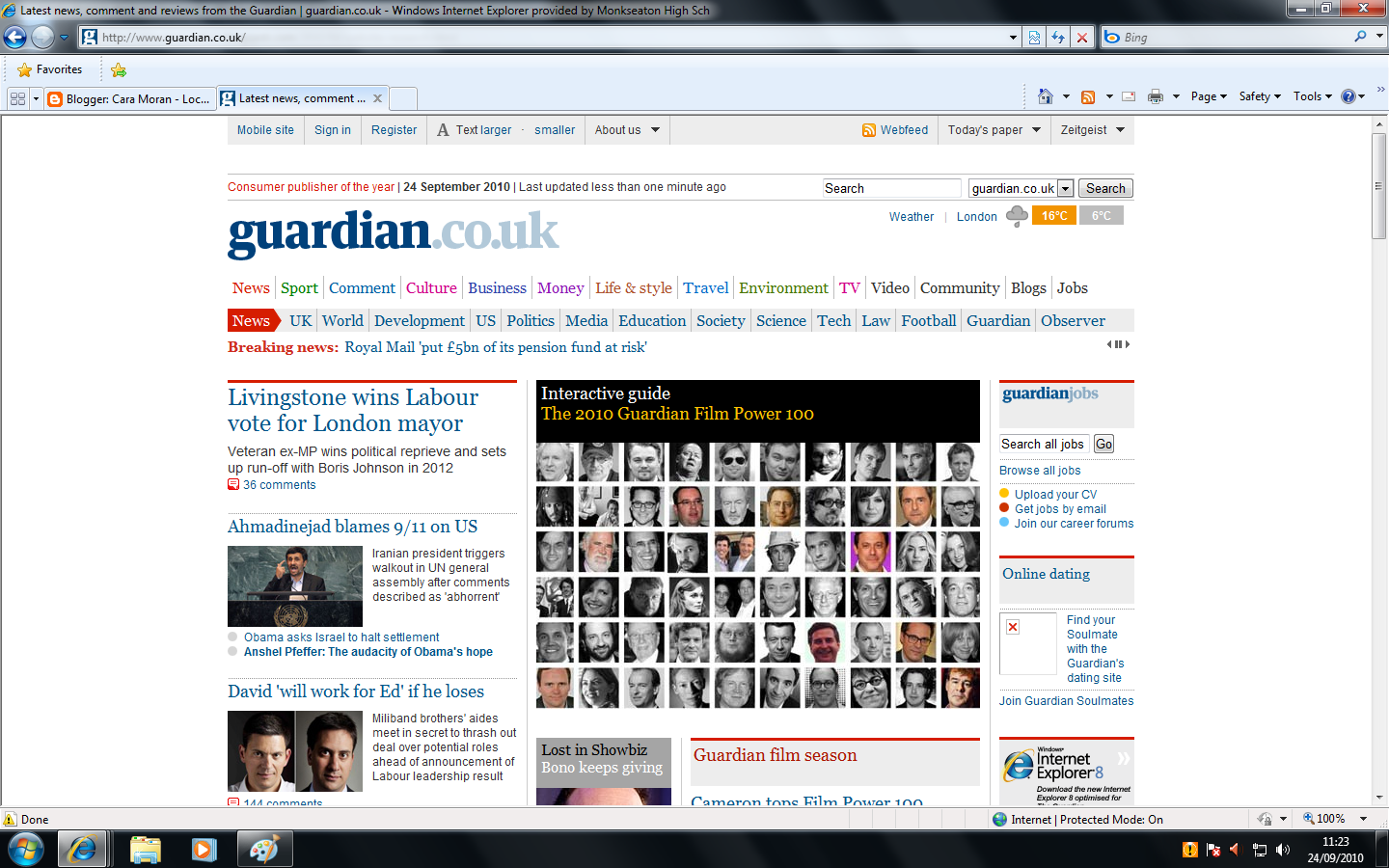
Again similar colour scheme and layout but doesn’t show as much text and crams as much on the page to entice the audience with the range of stories. Also by having more images than text makes the reader scan the page more to see the range the paper has to offer. Although it is again not a local newspaper it shows similar characteristics with the layouts. This newspaper has more options for stories therefore have a wider audience base and the predominant stories seem to involve the media. For instance the main story on the home page being 'The 2010 Guardian film power 100'. Different from the others the masthead advertises the website rather than paper by having 'guardian.co.uk' therefore it’s trying to separate itself from the paper and try to make the website as high profile as the paper.